Intuitive UX/UI
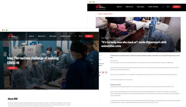
The old MSF site needed a UX/UI revamp. The donations platform was not integrated and the site was not intuitive for admins or users. In addition, it was not optimized for mobile-first.
Vardot reworked the UX to remove technology silos and streamline the user experience for front and back-end users. In redoing the Information Architecture, the content structure was organized to be able to be dynamically populated into the site’s breadcrumb navigation. This also enhanced the site’s SEO capabilities by improving the relevance of indexing and increasing the likelihood of being matched to the correct searches. Key UX improvements included:
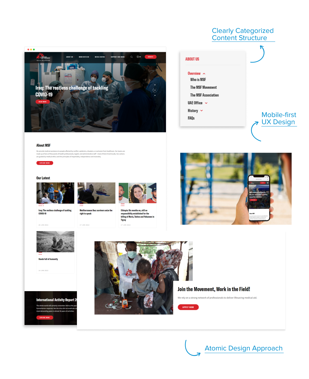
- Clearly categorized and intuitive content structure
- Enhanced indexing for Google bot crawls
- Clear website visitor paths
The overall look and feel were updated to reflect a contemporary and efficient organization. In line with this concept, UI design implementation uniformity was ensured with an Atomic design approach. Base elements were initially defined. Consistency was then catered to up to content template levels. This ensured that the site would have a holistic look and feel, even if multiple team members were updating content simultaneously. Key design enhancements were:
- Mobile-first UX design
- Atomic approach for consistent look and feel


