- Solutions
- For Industry
- By Need
- Products
- VarbaseEnterprise CMS Distribution for Drupal
- Uber PublisherEnterprise Digital Media Platform Builder
- VardocDrupal Knowledge Base Platform
- Campaign StudioOpen Marketing Platform - by Acquia
- Open SocialSocial Business Platform - by Open Social
- Services
- Strategy
- Design
- Development
- Migration
- Support and MaintenanceSupport and Maintenance
- DevOps
- Digital Marketing

Datasheet

- Clients
- Ideas
- About
- Contact Us

Atomic Design Project for a CMS Website
Recently, many UI designers talk about system design guides, patterns, or atomic design approaches. Any followed methodology will result in saving time and effort. When you customize these approaches to meet your own designing methods and tools, it will cut the design process time into half and concentrate your efforts on what is important.
Once I attended a seminar in Brighton, where a company articulated how they are implementing atomic design principles to build the website. They elaborated how they are turning their attention to designing for multiple devices in which focus the attention towards designing components, elements, and building design systems instead of thinking about static page layouts. Creating a flexible design system that will support creativity, enhances design performance, and speed and shift our focus to creating wonderful experiences.
Different design guides and methodologies save user interface designers time and effort. Yet when you further customize these methodologies to meet your own methods and tools, you can further reduce your time spent and concentrate your efforts on other tasks.
While attending a seminar in Brighton, England a company articulated their implementation of the atomic design principles into their own design process. They elaborated on when they turned their attention design for multiple devices, they focused on designing individual components, rather than whole page layouts. Thus, it created a flexible system that allowed them to increase their design speed.
In this post, we are going to articulate how we built (and are continuously building) a design system, inspired by the atomic design concept. In doing this we have applied it on Bohemian Coding Sketch.
What is the Atomic Design?
The concept of atomic design is to break down the design into smaller parts, starting with smallest elements, the atoms. This consists of typography, colors, lists, buttons, and more. Combining these atoms together forge molecules such as the search bar, forms, tabs and navigation menus. And the cycle continues to build larger components forming organs such as the header and footer. This iterative cycle of adding levels grows the complexity and continues until the pages and templates are built.In the nutshell, the atomic design is a bottom-up approach of using building blocks to build elements that will serve as reusable components that will generate the entire site.
Implementation of Atomic Design
Implementing atomic design for our company wasn’t a straightforward task. We are an enterprise web solutions provider that uses Drupal and open source technologies to build web applications for various clients across different industries. For the design team, this translates to different UI/UX for each project depending on the requirements, objectives, goals, and needs. Goals can range from generating sales, building awareness, delivering content, building a profile and more. Drupal can be used for many industries, audiences and objectives which makes it difficult to find one design methodology to fit all.
Our design process is very typical in which we start with the information architecture through solid comprehension and analysis of the objectives, user characteristics, and requirements. This stage is represented by multiple diagrams, charts, and wireframes which undergo an iterative process of evaluation and implementation. Our new approach that is currently a work in progress is to integrate the wireframing process into the atomic design methodology. And here is how we do it.
Atomic Design Using SketchApp
We use Bohemian Coding Sketch for all our design processes, even for wireframing which also abides to the atomic design principle. We started a “living” document using Sketch that is continuously updated through every single project. The file exists with templates that are based on foundational needs such as the grid system that is used across all our work. By defining the frameworks using Sketch, typography styles, layer styles, symbols, and much more the daily mundane tasks were becoming seamless (We are not following the Atomic design literally in all of its means, since we are not creating a design file not CSS styles or JSON variables to generate an HTML page, as found in Pattern Lab. But we built it in an approach using the available relevant features within Sketch App.).
The Design Template File
We have attached the design file into this blog post for everyone to use. The design file is divided into five pages: The Colors and Typography, Grid System, Icons, Components and finally the Design. This results in defining main components on an organism level, to ensure changes would apply through all used instances. Here is a breakdown of the individual pages.
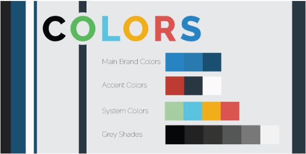
1 Colors
First, on an atom level, we took a thorough look at the Bootstrap CSS components. Then used “layer styles” to define a list of colors palettes that are linked through the entire design file. All colors are calculated on LESS variables using Hex Color Tool. This provides the design system with flexibility to start any new project by defining the main brand colors, the lighter, darker shades, and the accent colors.

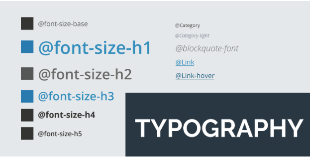
2 Typography
Next step is creating typography guidelines, starting from Headings H1-H6 and the body or base font. Here I started my template using 15px instead of Bootstrap standard of 14px. These styles do not encompass the entire typography system; however, they act as the base to kick-start a project with consistency from the first step. As the project grows, more styles can be added on demand.

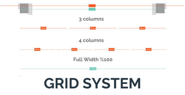
3 Grid system
Defining the grid system is a straightforward process following the Bootstrap framework. In the design template, I have managed to list the most common grid layout systems used in any frequent web project. Yet an issue issue that needs to be addressed here is that when using Sketch to design for Bootstrap we encounter a problem. Sketch follows the perfect pixel principle while Bootstrap uses percentages so getting an accurate layout to half the pixel is not possible (Thus, for screens larger than 1200px the used container is 1170px by taking 15px from each side to leave space for the scrolling bar. In addition to subtracting the common paddings from both sides leave us with actually 1140px actual container size. In this case, the logical division for the grid system is 30px for eleven even gutters which is the 15px padding for each column side. This leaves the rest of columns to a width of 67.5. This scenario when using sketch does not work, since there is no half pixel in the layout settings).
The solution is simply to take the approximate measures as we are working with responsive designs. I divide the column width to 68px and 30 for gutters. The result is an accurate layout for the columns width while the gutter will vary between 29px-30px, leaving a difference of 6px. Hence, if you follow the grid division in the template the difference will range between 1-4px, which won’t affect the quality of the exported asset at all. Just be careful when you exporting @2x or @3x for retina screens.

4 Icons and Elements
These are a simple collection of icons that would be commonly used in different projects. We typically use Bootstrap icons or Font Awesome. During the course of the design we customize when needed but having the basics available saves initial time.
5 Components… And now we start the design!
Okay we’re at the final stretch and this part is a piece of cake! After defining all the above, here comes your creativity. Now you have to manage the design after building the bases, start by defining major components such as the header, footer, forms, image styles, and other general elements. In this stage, we start to appreciate the freedom of creativity and the solid consistency that the Atomic approach has laid out for us to pursue by mitigating the unavoidable mundane design issues.
At this point, the customized elements begin to form and the design outcome starts to take shape. What’s left is combining all the previous organisms.
What’s Next?
The atomic design file is a living document that will keep growing throughout each project to save time allocating effort where it should be. Until now, we have a very dynamic design framework.
If we want to start a new wireframe project desaturate all main and accent colors and start the gray boxing wireframing technique. Once the wireframe phase is completed, it takes a few clicks to define these colors and viola! We get a colorful wireframe transitioned into a design. What’s left is changing the images placeholders with an actual pictures, making final adjustments, adding actual content and perfecting the design layouts.
Feel free to download our Sketch template and keep tuned with our blog as will share more about this topic and cover more on the Atomic design system.
- Web Design


