There are a few dozens of logos well recognized around the world. However, even the strongest of them passed a thorny path from the inception. We believe the logo redesigns were crucial for the development of the top world brands. Let’s recall the history of the 3 popular global companies, Apple, Google, and Nike, and analyze the way they updated their logos. But before starting our journey, I suggest you have some fun considering the most awkward logos!
Now when you have some examples of redesigns that you shouldn't do, let's switch to best practices and see how Apple, Google, and Nike boosted their conversions by redesigning logos.
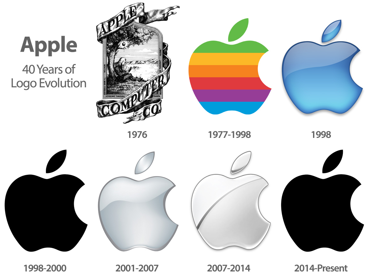
Logo design history: Apple
The Apple’s first logo was created by Ron Wayne. However, this name is hardly recalled even by geeks. Meanwhile, Ronald is the third co-founder of Apple. He sold his 10% stock right after the registration of the company and lost about 30 billion dollars by doubts about the future success.
The first logo has nothing in common with the present version. It was a miniature work of art depicting Isaac Newton and an apple above that is almost falling on the scientist’s head. By scaling the emblem, one may see the following text: "Newton… A Mind Forever Voyaging Through Strange Seas of Thought … Alone." This is a line from William Wordsworth's autobiographical poem called "Prelude." The logo appeared interesting and was used about a year.
(Image source: http://www.thegraphicmac.com/wp-content/uploads/gen-Apple-Logo-Evolution.jpg)
Then, Steve Jobs asked Rob Janoff to create a simple, modern-looking, and well-recognized logo. It was ready in a week. The famous nibble was made intentionally. By the way, the emblem had been colored a year before gays began to use a rainbow as a symbol. According to Rob Janoff, Apple logo was designed to reflect the fact that the company produces computers with color monitors (these colors been listed on the logo).
22 years passed until the next redesign. In 1998, Steve Jobs, who had previously been fired out of Apple's, returned to the company. At that time, Apple had huge financial problems. Competitors maliciously advised the company to shut down and give the money to the shareholders. And you know who helped Apple? Jonathan Ive, an industrial designer who came up with a new system block for iMac G3. Computers that looked like candies literally saved Apple. Moreover, they have become iconic!
It is clear that the colorful emblem on a colored Mac would look silly. Apple moved away from the use of the colored logo. Since 1998, although some redesigns were made, the concept of sleek monochrome apple remain almost unchanged. Well, the company has matured.
Logo design history: Google
The history of Google starts from 1998 when Sergey Brin and Larry Page presented the face of their searching algorithm in the form of a lettered originally colored name in their research paper at Stanford University.
Google’s history shows the way the creators of the corporation found innovative solutions that are inevitable parts of the modern search engine. In particular, one of the logo updates gave birth to Doodles. Very few people know that the first doodle appeared on August 30, 1998, the year when the company's founders decided to leave the message to the audience, in which they stated they’re leaving the workplace. The first Google doodle was different from the modern by its design simplicity. If current Doodles "come alive" on the screen, the first doodle was made in the form of a man standing behind one of the "o" letters in the title.
(Image source: SarahDayan)
Initially, Google’s logo had an exclamation mark on the end. The corporation refused it in May 1999, when the fourth official corporate logo was introduced. With this release, the brand name received three-dimensional shape while the font became softer. Also, a shadow on the snow-white background appeared. In 1999, designers used the Catull font to make the appearance of the logo a bit more sophisticated.
In May 2010, Google's logo has become more vivid and stylish, but the colors and their order in the name remained same: blue, red, yellow, blue, green, red. In September 2013, the company refused large letters.
The last stage of the evolution was in September 2015 when the company got rid of serif font and optimized it for easy viewing from various mobile gadgets. The corporation explained that the new logo is intended to demonstrate "all the magic" on both big and small screens, thereby erasing the boundaries between different types of devices. Presentation of the new logo was accompanied by a two-minute YouTube movie in which the creators talked about the new logo and recalled some other important moments in the history of the company. The designers have updated the look of the logo not only on the main page of the search engine but also in the tabs.
The designers do not exclude the possibility the logo will undergo many changes in future.
Logo design history: Nike
We’re all familiar with Nike’s logo, approved by a huge number of sports superstars such as Michael Jordan, LeBron James, Andre Agassi, Maria Sharapova, Venus and Serena Williams, etc. The famous swoosh started as a weak logo and has gone a long way from humble beginnings to an incredible present.
In 1971 Phil Knight, a founder of Blue Ribbon Sports, hired Carolyn Davidson to design a logo for shoes. Davidson designed a few logos and Knight chose the swoosh although he didn’t consider it as a stunning option. Davidson got $ 35 bill. And a diamond ring with Nike's stock an expression of Knight’s gratitude after the company became one the leading world’s manufacturers.
(Image source: http://www.make-it-rain.co.uk/wp-content/uploads/2016/01/Evolution-Logo…)
Originally, the logo was presented as a "tape", but later it became known as the "swoosh" (consonant with whoosh). Actually, this name accurately represents the material from which Nike manufactures its sports shoes.
In the spring of 1972, the market got first Nike "swooshed" shoes, and a few years later, in 1995, the logo was registered as a trademark of the company and became its signature style. The image used today appeared nine years after the original logo was designed. Since then, the sign has been changed slightly. I was slightly tilted, blurred, and painted black.
The logo has a unique mission to bear inspiration and innovation to every athlete in the world. The history Nike’s identity is a wonderful example of how a simple emblem can greatly contribute to the success of the brand and transform the company into one of the most powered in the world.
Bottom line
Obviously, the aforementioned iconic logos went passed a thorny road from unknown signs to the most powerful elements of corporate identity. If we look closer, we can say that the redesigns of the logos were based on a deep understanding of the main brand principles and values.
You have to be patient and do not rush to change the design just because you do not get the expected recognition. However, if you feel it’s time to further develop your logo, don’t be afraid to redesign it. Change the visual appeal in accordance with the philosophy of the company and the future plans, and then you’ll have every chance to pay off.
Take a looks at Apple’s, Google’s, and Nike’s Year Revenues.
It’s clear that these companies grow their capital from year to year. Although it’s impossible to measure the exact contribution of logo redesign, it can’t be questioned!
A new logo is a great opportunity to remind customers of your brand. The larger the company and the more radical the redesign, the more attention it attracts. Be ready for a few weeks of hype. Nevertheless, don’t turn the redesign into an end in itself. Although groundless redesign is able to attract the attention of the audience, it won’t increase brand loyalty and will likely be perceived as a dubious indicator of the brand development.